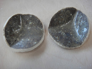
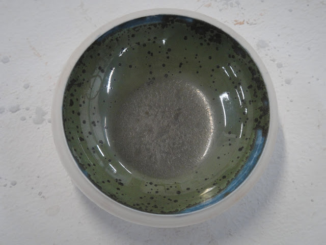
Finally got some new glaze tests out of the kiln the other day!!! Allen Richards has mainly been concentrating on lustre glazes, while I have been more preoccupied still with flambé, but also matt and other mottled glazes. I can't blame Allen though, to be honest, as he's finally got the technique to work, and lustres are enough to bring out the magpie in anyone!
First off are a set experimenting with the addition of cobalt carbonate in a few of my favourite glazes to see how I could get some bluer variants, as I don't have a deep blue at the moment:
 |
| Emanual Cooper's original glaze |
This is one of Emanuel Cooper's glazes with added cobalt. I really didn't expect this result, as this is originally a mottled matt brown glaze and I thought I might get a blue tinge or something! Instead the glaze has become shiny, almost gold tinged where it pools, khaki green with mini crystals (magnesium in one of the ingredients has done that) and teal where thin. After this I found out that the way this glaze went matt was due to a high number of fluxes in the glaze causing it to over flux (weird how chemicals that encourage the glaze to melt in the kiln can actually mess up the way the chemicals melt and react altogether). However, adding extra flux on top of that (cobalt is pretty fluxy) really sends the glaze into overdrive and it will become very shiny. I might try reducing the copper in the next sample to reduce the green element and hopefully bring the matt surface back. Also the dolomite.
 |
| Original Aurora Borealis glaze |
This glaze is Aurora Borealis with added cobalt (Aurora is one of mine and Allen's favourite flambe experiments, although it is a little difficult to control). I absolutely love this result. The original was a lime green ground with royal blue where it pooled and turquoise jun effect over the top of that. This is basically the same but much more mellow with less saturated colours, over all darker and more of the subtle iridescence. We've named this new glaze ocean deep. I can't wait to try it out on something larger than the test tile! This is now getting very close to being an oribe, a traditional green Japanese copper glaze I'm very interested in learning about, except that this glaze is blue.
 Weirdly though, it's almost like a tenmoku if you use it on terracotta! The iron in the clay body majorly interferes in the reaction of this glaze. It pretty much pulls a full on invasion really. It's amazing for bringing out the marks left from the throwing though, it's incredibly striking. This is much darker than anything I've looked at using before though. Where it pools it's pretty much black, with rust reds, oranges, yellow and even green where it's thinner.
The original glaze for this test before the cobalt is Solar Eclipse, mostly abandoned since it was superseded by glazes with more jun effect and more colour overall (also less pinholing - our glazes like to bubble). However, it was really interesting as although the background came out mostly white, the pooled areas had a kind of purplish navy streaking and jun effect. Our main problem with it was the lack of colour, and we soon developed a bright purple with a new base glaze and the same oxides. However, if the background could be coloured, this Solar Eclipse would take on a whole new lease of life, and cobalt, from my observations with previous experiments in these base glazes, always principally colours the background. As you can see, that is pretty much what has happened, although I had hoped there would be a greater amount of streaking and variation in hue. It has also pinholed badly. This probably still needs some work to achieve it's full potential.
This is another test with the Emanuel Cooper glaze, but this time with iron oxide. I'm not really sure what I expected this to do! I think possibly a different shade of brown. Still, the iron has mainly over ridden the original properties of the glaze and created a surface that looks very much like rusty metal. I love the tactile quality of it, it's such a contrast from the usually glassy results, and has an authenticity due to its sympathy to the actual clay's texture. It feels so natural in the hands. I have noticed over the period of my studies that much ceramics uses very shiny glaze, and that people actually really prefer matt or rock like surfaces on their ceramics. If they want shiny, glass is much better at it. They want material that comes from the earth to look like it. Wabi strikes again! I think I might try reducing the iron a bit though to allow some of the original glaze properties to come back.
Next is my other favourite result besides Ocean Deep:
This is the Emanuel Cooper with manganese and reduced copper. From research Allen undertook I thought I might get something approaching a matt mottled gold, but I got this instead. I think it's stunning. Unfortunately the surface scratches easily, but it is silky smooth to the touch, and a very dark gold in colour. The surface is scattered with tiny gold crystals (magnesium again) and there is subtle iridescence on this glaze too. I'm not actually a fan of large expanses of bright gold, for a start, I much prefer silver, and secondly I tend to find it a bit tacky because overuse makes it look fake. It's just never been my style, although Allen works with it very well. However, this glaze is so subtle, and has so many qualities that aren't obvious from a single glance, that I find it quite alluring and interesting to look at because it can be explored. I also think it looks very natural and is a beautifully striking contrast to the other brightly coloured glazes I use.

After the success of the first one, Allen quickly mixed up a new test with more of the oxides from his original gold glaze in the hopes of developing the gold properties in this new glaze. However, all it did was turn the glaze matt, increase the crystals and reduce the iridescence. The photos won't pick it up, but there's also a hint of mauve in there as well. It's an interesting result, and more what I originally aimed for, but I prefer the first test as it has more interesting properties and a better colour.

Of all the glazes tested, this is the only one I really consider a failure. This was based on Sun Flare, a honey and lilac coloured glaze with jun effect over the lilac where it pools, and I added iron oxide in the hopes of developing the honey colour and possibly getting tenmoku effects (I have done screen print tests with the same oxide underneath Sun Flare, with spectacular results - I will post about that soon). However, I persuaded Allen to put in far too much iron against his better judgement, and the oxide has overloaded, caused bubbles and left a gunmetal finish on the bottom. This will be tested again with much less iron. Probably about half as much.
This is a different Emanual Cooper glaze (originally a matt white with interesting variations in hue and crystalline tendencies in reduction). I'd hoped for a turquoise or green matt with the variation in hue, but again, it was matt due to over fluxing from zinc, and the addition of more fluxy oxides has turned it shiny and allowed the zinc silicate crystals to take over. A lovely result, but not what I'm looking for on my current work, and the crystals have overcrowded themselves as well. I think I'll try reducing the zinc a bit and see if that will bring back the matt surface.
There seems to be a weird gold shimmer across this part of the sample.
Finally, we tested our Royal Purple (a bright purple glaze with jun effect) with cobalt to expand the colour possibilities, and it is now much bluer, more like the traditional indigo dye often used in Japan. Next task will be to make Royal Purple more pink so that we truly can achieve any colour of flambé. I originally started researching these glazes in an effort to reproduce the colours of modern Japanese media with a natural and traditional type of mottled glaze, and expanding the colour palette is a part of that. It's also just peaked my curiosity. Expanding the range of colours will help to widen the appeal to the general market as well, as everyone has a different colour preferences, the colours set each other off when shown together, and people also love to mix and match within a set or style.
For these tests we have developed a new test tile, which for the first time is truly both of our work. Allen had been trying to create a thick walled shallow dish with a tiny delicate foot ring, but could not get a satisfactory result from the jigger jolly for which he had made moulds. I had yet to develop a test tile that I truly liked and could make in bulk. So, I decided to throw shallow dishes for Allen and put my signature spiral in the base, and then he turned the foot ring, which is his speciality. This is much more economic for both of us, and the results are beautiful too :)
We hope to be able to market these with the glazes on in the future as snack bowls, tea bag holders, or just pretty objects in their own right. The speed we can make them at means we can batch produce them for shows, and they can form a very affordable range for people who want to buy a little something.
The last thing I did was test terracotta's ability to stand up to porcelain temperatures in the kiln - 1260 degrees C.
It stands up to it better than porcelain does in the end, although is much more prone to thermal shock in the cooling, so I must be careful not to open the kiln until it is fully cooled. The handle has not warped at all, which is a breath of fresh air after so many faults in my porcelain tea pots. It is also a really nice deep russet brown with a few iron speckles, similar to Japanese tea ware I'm inspired by. Now I'm ready for the actual teapots to fire.


No comments:
Post a Comment