Tuesday 28 February 2012

3D printing for all! :D

This is amazing - anyone can make a 3D object in CAD software, send the design to http://www.shapeways.com/ and order as many or few copies as they want of the design printed in 3D! You can even sell your designs through that website. This would provide a fantastic way of mass producing bread and butter type work, and you get a choice of material to have your design printed in, even ceramics, glass and precious metals. Although, at the moment it is not clear whether you get a choice of finish with the ceramics. I'd be really interested in trying this out for myself. I wonder if they can print origami? Actually, I wonder if I'd be able to construct it on a computer.......

I found out about this through Michael Eden who was asked to give a talk at uni. He's a ceramicist who has gone from throwing and slip trailing to using modern technology and computers to make his work, and he's created some fascinating pieces based on coil potting (but 3D printed of course) and the codes used by smart phones to access websites and info. I love the intricacy and detail he can achieve as well as the heavy cyber influence, since I've been looking for a way to involve the more gadgetty and robotic side of modern Japan in my work to contrast with the traditional.


Monday 27 February 2012

Flower Pressing and Microwaves

For those with no patience, did you know you can press flowers in the microwave? My A level textiles teacher told me about it once, so I tried it at home with my flower press. Unfortunately, I forgot that my flower press had metal screws in it (I was probably daydreaming again) so it wasn't until I could smell a suspicious burning smell that I realised I'd set the microwave on fire. Well, the flower press at any rate. Oooops! I hadn't tried it since then until tonight. I did a bit of research this time and found a couple of websites who talked about it: http://www.joannasheen.com/tuition-advice/how-to-press-flowers/ and http://preservedgardens.com/how-to-press.htm. Since the two sites seemed to corroborate pretty well, I sandwiched my flowers (the remains of the bunch I'd been drawing from - they were finally starting to wilt and some had become seedheads) between at least two layers of folded over scrap A4 paper, placed them in my 700 watt microwave and piled two pyrex dishes and a pyrex jug on top to flatten and weight it all down. The websites recommended short bursts, so I was microwaving for about a minute and then taking the paper out to dry off. It got really wet in there! The first few flowers I was giving maybe up to 4 bursts in the microwave, but they were getting a kind of tan halo around the middle (scorch marks?!), so I tried microwaving for less time with more drying out time in between. In the end, about a minute and a half seemed the best time, any less and the petals were still juicy. Lots of blossoms, a weirdly smelling kitchen (somewhere between something floral and a deep fat fryer) and burnt fingers later, here are the results:

Left: The remains of the flowers

Right: After pressing. Mostly the ones near the top of the picture are the last ones I did


So I have now recorded the life of these flowers from the start until the end through drawings, photos, and finally pressing them as they were going through the various stages of dying. Strangely, they both attracted and repulsed me at this stage, the droop of the petals was quite graceful but the dead brown centres of the chrysanthemums looked really disgusting to me at first. According to sabi, things gain beauty through age, and certainly the life cycle of the flowers is very interesting to watch and record, but the actual dead petals don't hold much for me. However, I do quite like the slow disappearance and transient quality of flowers, and it is much more interesting visually to draw flowers at all the stages of development rather than identical perfect blooms. I think people get fed up of an idealised aesthetic in the end, it's not realistic, and it gets boring and depressing after a while. Reality is made up of the good, the bad, the beautiful and the ugly, and if you can find the beauty in an ugly world, it is a much greater treasure for coming from a world you can relate   to, for its authenticity, and for the hope it represents for everything else. It's also a beauty you can't take for granted. I can't really explain it very well though.


Friday 24 February 2012

Ken Matsuzaki

Just a quick post as I'm not feeling so good, but saw this when I was checking my facebook messages and the combination of glaze and pattern caught my eye. This huge platter is apparently in the region of 76 to 96cm AFTER firing! That takes an insane amount of skill. If I get the chance I'd love to see the exhibition.


Ken Matsuzaki
松崎健大皿展
直径76cm〜96cmまでの大皿30枚だけの個展
30枚それぞれが世界をもっています。
東日本大震災復興支援特別企画展
宇都宮 青木ギャラリー
☎028-639-0307 "


It you happen to be able to be in Utsunomiya-shi, Tochigi-ken, Japan in time for this exhibition.....check out some fantastic huge platters from a great ceramist. (And some proceeds of salesare going to the reflief efforts too.)"


I took a look at Matsuzaki san's facebook page after reading John's message and found a couple more pictures - a platter before firing:


Matsuzashi sans shard pile - apparently half of these are pots damaged by the big earthquake. I saw another potter's shard pile while in Tokyo, and they're actually very beautiful with the mix of dead leaves, twigs, and shimmering glazes all over the floor. In this setting it no longer matters that the pots are broken, they take on a new life and meaning of their own as artificial stones and rocks:


Shards of oribe glazed ware among the leaves at Shigemasa Higashida san's studio in Tokyo when I visited:

Monday 20 February 2012

Cyber teapots


The results of playing in solidworks - the first (and made in a hurry - I was about to be thrown out) pictures of my new cyber teapots.
Having got past the problem of creating a sieve over the spout (for leaf tea lovers) and cutting off excess extrusions, I've been playing with the handle ergonomics and form. Next I'm going to try and pierce out the flared foot ring at the bottom of the teapot, as I have never tried a wrap feature tool before - I want to know how it would work to wrap a series of patterned cut outs at the base. Then of course I need a lid.

The pot on the left has a smoothly arching handle (arch created using the spline sketch tool and the mirror entity tool to get it symmetrical) with a slightly sickle moon like profile to create a dip in the upper side for the thumb to rest in (and because I wondered what a cross section different to oval would look like). This was turned solid using the swept boss tool (basically it tells the cross section to make a solid extrusion that follows the path of a line you draw for it).

While using this I noticed a twist option on the swept boss. I got curious, so I tried a twisted handle next. This was a bit more complicated, as I discovered it would only work on a line with no joins in it. It had to be drawn in one go, and splines are not the most easily manipulated lines, so it probably isn't too symmetrical (and it certainly isn't round at the top!). However, once you get past that, it's quite easy, you set the swept boss to twist along the path and control the amount of twist by telling it an angle to twist by. I engineered this one so that it has a levelled out section at the top for holding the handle by. I really like this effect as it's visually quite striking, so I'm going to experiment with it some more on my next handles.


If all goes well, I hope to be able to design a teapot for the Wedgwood Museum shop using this software and then create a mould using 3D printing so I can batch produce them! The Wedgwood Museum is a huge collection of ceramics spanning the entire career of the Wedgwood ceramics company from the 18th century to the present day, based in Stoke on Trent: http://www.wedgwoodmuseum.org.uk/home


Wedgwood is one of the most famous names in British pottery, with Josiah, the founder, having been a great innovator and scientist, developing new materials and techniques to create their signature blue jasper ware with white relief moulding (so, my use of software to create Wedgwood inspired teapots seems somewhat fitting). However, when the company went into administration, and after a long (and continuing) court battle, the museum has been found liable for paying the debts of the Wedgwood company pension fund: http://www.telegraph.co.uk/property/interiorsandshopping/antiques/9001313/Wedgwood-family-call-on-Attorney-General-to-save-their-museum.html
This is a huge shame, as this museum is unique in that it shows the creative and technical progression of a single maker/company through history, and as a result there are things you can learn from viewing this collection that you can't from most museum ceramic displays. Most museum displays show a range of ceramics from a range of makers, sometimes from one time period, or sometimes over history. These can show you ideas and techniques from the different times, but it's harder to see the progression as every maker   specialises in their own techniques and styles.

So, the Wedgwood museum is asking artists to create pieces to sell in the shop to help raise money to prevent the collection being sold off, and this is how I got involved. Anyone interested in supporting the museum should visit their website above.

Thursday 16 February 2012

Plane tickets and visas

It's finally sorted, I've bought the plane tickets to Japan! I'm definitely going for work experience in Tokoname. 
:D :D :D

As Tokoname is near Nagoya airport, I'll be flying from Birmingham via Frankfurt to keep the airport taxes down (London and Narita are not cheap!) and the prices Lufthansa are offering right now are actually pretty good, about half what I'd reckon was an average fare to Japan. If I'm lucky, I'll be just in time to see the sakura bloom and join in with the traditional hanami - the Japanese cherry blossom viewing parties.


All that is left now is the issue of visas. For the period of time I will be there (about two months), and considering I'm not being employed as such, whether I need a visa is, according to the Japanese embassy in London, a grey area. If I have no visa, I can't accept payment or monetary support from what I gather, so if I have the opportunity to sell work I make out there, I can't take it. Since they seemed so unsure of themselves, I'm going to apply for a working holiday visa. At £22, it's well worth it if it gives me freedom and peace of mind to enjoy my stay in the country. It's for people aged 18 - 30 who intend primarily to holiday in Japan, but want to earn some money to support themselves while they are there, and is valid for up to twelve months. All I have to do is download the form off their website, provide a CV and a statement of what I intend to do in Japan, and show a few other documents like my passport at an interview at the Japanese embassy in London. According to the guy I spoke to on the phone, it then takes about a week to process the application, and then they can post it to you. For anyone interested in visas for Japan, the website is:

http://www.uk.emb-japan.go.jp/en/visa/work_hol.html

I'd better get writing!


Monday 13 February 2012

Ink, Print and Chrysanthemums

I bought a bunch of chrysanthemums, carnations and different daisies to study and draw from, and ultimately visually play with on paper :)


I decided I wanted to inject my own ideas and style into what I was looking at rather than just record what I was seeing, and these are the results so far (incredibly, the flowers haven't shown much sign of dying so far - even after a couple of weeks there are still some opening up!)

With my teapots I've been trying to layer up imagery and print on the surface, so I tried playing around and masking off the outline of a cherry blossom with masking tape. Then I used brown ink to paint the chrysanthemums, sumi-e style! The brown is a bit more subtle than using black, and tones nicely with the brown paper. Having got this far, I decided the detailed drawing on it's own wouldn't be enough to allow the sakura outline to be clear and stand out, so I roughly brushed some translucent iridescent blue white ink over the flowers, and finished by tinting the flower centres with coloured chalk dust.

Then came the tricky bit - taking the tape off again.....


I really like how the two of these images came out, but I actually really like the piece before I removed the tape. It looks like the next experiment is going to involve cutting and sticking coloured paper flower patterns to make a sketching/painting surface! I really like the way the imagery overlapped and glowed through one another. I should be able to translate this onto the teapots using coloured clay, slip trailing and screen print all layered up. I think just a small area of imagery like that (created with some nice earthy oxides or something subtle) could be really understated but really elegant too. It'd be too much if it covered the whole piece though.


Here are the rest of the pages so far.

From the top: - Print with dip pen sketched chrysanthemum tinted with chalk dust, the first layered imagery test
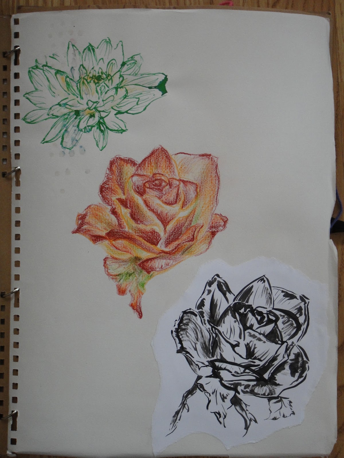
- Roughly sketched rose in dry watercolour crayon, basically a quick exploration of colour
- Sumi-e rose in black ink, exploring shape, line and shadow.

For anyone interested, the Japanese name for rose is bara. The anime Saiunkoku monogatari has a really interesting fairytale it mentioned about the "rose princess" (bara hime). I don't know if this was just made up for the plot line, but it talked about why roses had thorns. Basically, the rose princess was a bit more than mortal, and very beautiful, with the gift of being able to cure any ill. Then she fell in love with a human man, so lost her power and died, becoming a rose and growing thorns so no other man could pick her.


Brush and brown ink chrysanthemums tinted with yellow, green and white chalk dust. I was trying to understand the form and shape, how they grew, and capture the spirit of the flower.


As before with a daisy and different kind of chrysanthemum (I think). I took adding colour to the brush drawings a bit further here, using watercolour to create rough shading and tints. I also put the print next to the drawings as a contrast to the layers.


More chrysanthemums - I'll probably work more into this drawing later


The other kind of chrysanthemum, this time with black ink and coloured print. I'm not so impressed with the starkness of the black compared to the brown ink, but I like the effect where the brush was starting to go dry - this is also what wabi sabi is for the Japanese. For some reason the fading nature of the ink reserve running out gives drawings a transient feel and beauty.


Iridescent print, with watercolour crayon and clear embossing liner daisies. I was trying to get a similar effect to slip trailing here with the raised outline, and then contrast it with coloured outlines.


The Golden Tearoom, built by Toyotomi Hideyoshi
Another embossing liner drawing, this time in gold. I'm considering using gold lustre to highlight certain bits of imagery on my teapots, as the Japanese often use it to highlight their designs to great effect on everything from washi paper to architecture. Although saying that, I think they went too far with their golden tearoom. I'll probably work into this drawing some more as well - I was wondering how it would look with the patterns from computer circuitry behind it.
Wooden carving of a dragon with added gold accents on the
bottom of a huge paper latern


Anyway, why chrysanthemums and daisies?

 The chrysanthemum is the official national flower of Japan (cherry blossom or sakura being the incredibly popular unofficial one), and in Japanese floriography (flower language) they mean happiness and long life, and are sometimes seen as an object for meditation. The daisies and chrysanthemums are very frequently seen in Japanese imagery and patterns, including everything from kimono to mon, Japanese family crests. According to wikipedia:

" Japan

  • The Chrysanthemum Throne is the name given to the position of Japanese emperor.
  • Chrysanthemum crest (菊花紋章, kikukamonshō or kikkamonshō) is a general term for a mon of chrysanthemum blossom design; there are more than 150 different patterns. The Imperial Seal of Japan is a particularly notable one; it is used by members of the Japanese Imperial family. There are also a number of formerly state-endowed shrines (官国弊社, kankokuheisha) which have adopted a chrysanthemum crest, most notably Tokyo's Yasukuni Shrine.[15]
  • The Supreme Order of the Chrysanthemum is a Japanese honor awarded by the emperor.
  • The city of NihonmatsuJapan hosts the "Nihonmatsu Chrysanthemum Dolls Exhibition" every autumn in historical ruin of Nihonmatsu Castle.[16]
  • In Imperial Japan, small arms were required to be stamped with the Imperial Chrysanthemum as they were considered the personal property of the Emperor.
  • The Chrysanthemum is also considered to be the seasonal flower of September. "
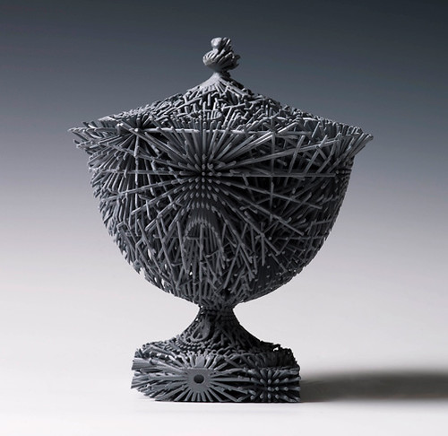


Friday 10 February 2012

CAD CAM - computer aided defects and computer aided mayhem

I'm sat in the computer room at uni with solidworks right now, and, hallelujah, I've found out how to create new sketches and planes within the software! This means I can finally freely work in 3D with curves and varying shapes. Sort of.

Anyway, I've been playing around to test what I can get the software to do, and here are the results!


A lidded maple wood box with lid and raised butterfly decoration :3

This is the first thing I made a couple of weeks ago. This is actually less complicated than it looks - all you have to do is draw a square, extrude it (so it's a box), shell it (so it's hollow), and then you can select one of the sides to draw the butterfly on and extrude that as well. Same principle for the lid. The fun starts when you start involving curves....


... however, this one behaved because it only curves one way! This time I was checking to see if I could make solidworks revolve a profile (kind of like a cyber lathe), and it would seem that it's very similar to the software I first learnt with, so no problem.

This is what I was doing this week - experimenting with creating a "lofted" extrusion. This basically means you create a solid form which is a merge between two drawings - in this case a kind of splat shape and a circle. It was at this point I found out that the "insert new plane" function was hidden under the reference geometry menu in the features part of the program, instead of in the menu showing the planes in the sketching part of the program. Also that new sketches are created by right clicking a plane and selecting the sketch icon. Now able to create two parallel drawings, I was able to do this. I think it will take me a while to get used to the different layout of the software, but I had fun shelling this form out to make a vase and then turning it into hyper reflective turquoise glass vase. 


After that I had a go at cyber spaghetti, aka a swept extrusion. This is pretty much where you draw a profile, then draw a path for that profile to follow so you get a long wiggly solid sausage, but I'll post a picture later. It turns out there's a fair bit of control with this feature, you can control the path the profile follows but also how it curves around the path. There are similar controls on the lofted extrusion, so I found a new way to create teapot spouts which is pretty handy. At this point I was able to go back to the virtual teapots which were causing me so much trouble before, and trim the excess spout poking into the main teapot body and cut the sieve at the base of the spout to drain the tea leaves. I even started on a handle. Definitely progress :) 

Well, I'll have to wait a bit to show you the rest as I've been kicked out ready to lock up for the night, so goodnight!

Tuesday 7 February 2012

Tokoname Teapots on Facebook


For anyone interested in Japanese teapots, this is a really good page on facebook. I came online tonight and this maple leaf one caught my eye - it's so delicate and simple.

http://www.facebook.com/japanesquestyle

There's also a website, but it's in Japanese. I'm trying to organise to go and do work experience with a potter in Japan, and now I'm having fun browsing this page with all the different clays they use - it would seem that their clay bodies all fire a bit lower than I am used to firing. There's a nice range of terracottas and darker browns (even a black), as well as a soft creamy white (although I don't think it's porcelain, as it's labelled shiroi do, which means white clay, and not jiki, which means porcelain): http://www.japan-net.ne.jp/~yakimono/
It looks like you can buy bags of it from this page. Very tempting.

I've been thinking about trying out some terracotta again for a while, it might be nice to do some earthier, darker work to contrast the white, and it will allow me to get used to the clay bodies I'll probably be working with out there. We'll see if I have time this semester!

Red Fuji


I guess this is why "the land of the rising sun" has a red flag, and I start to understand why red is such a symbolic colour for them. This is such a powerful image of Mount Fuji! Even though it's sunset not sunrise.

What with the autumn Japanese maple leaves as well, red seems to have strongly associated itself with transition and changing states in this country.

Katana - Japanese swords


I love katana, but I have probably watched too many ninja and samurai movies! I've watched documentaries and read articles out of curiosity, and gained a great respect for the workmanship and skill in wielding and making them. Every stage is thought out and given every attention, from smelting the black iron sand with oak wood and sorting the pieces into soft and hard, to polishing the blade. 


The resulting sword is then so light and sharp it can slice through bullets and ice! Unlike European broadswords, they rely on skill and speed instead of brute force to be successfully wielded. Aside from that, I also love the fighting style that goes with the blades, and the long sweeping curve along the length of the sword which trace dance like patterns through the air when it is swung. I use similar curves and length in my teapot handles


This is the latest teapot I've been working on. It's another square bodied piece, working on the size and capacity from my previous one, and developing the imagery on the side. I've added screen print under the slip trailing to imitate the effects you get in modern Japanese printed media, especially manga, and this time I did a peony, plum blossoms and pine as it's winter right now ^.^
I'm not yet sure that the pine comes out too well yet though, I'm going to wait until I've glazed the piece to see whether the needles make it too busy for the imagery to be clear and stand out. This is the tallest handle I've created to date, and I'm a bit concerned about how much it will warp in the kiln. I'm hoping to use a new firing program to limit how much it will move in the kiln - I will hold it at top temperature for maybe only three minutes, and soak it for a long period of time at a lower temperature to allow the glaze to develop properly, so that nothing will be liquid/hot enough to run for very long. Anyway, you can see the height and gentle curve of the arching handle here, which has developed over time kind of subconsciously. It's a reaction to many things, Mel Brown's teapots (shown on the right), Japanese architecture and blades, and the way I naturally interact with the clay - I generally pull long lengths of clay before I'm happy with the shape and thickness down the length.

Friday 3 February 2012

Lily Blatherwick


Just found this artist when going on The Potteries Museum website (http://www.stokemuseums.org.uk/pmag/exhibitions/index.html?sid=7edd144912f8d3092bcd37ad4f6ee4b3

Her name is Lily Blatherwick. I love how expressive her mark making is here, I think it's done with graphite powder or charcoal, and then scratched into and rubbed away in places. The play of light is amazing as well; if I remember correctly, this is a renaissance technique called chiaroscuro, where there is a large contrast between light and dark areas. Often, chiaroscuro pictures used light to pick out the composition from a very dark background, making them very dramatic and mysterious looking, with the total amount of detail often quite subtly left to be discovered after the first glance. There is a roughness here that somehow seems to emphasise the delicacy of the subjects, as well as a great deal of energy that gives the image life, just like with Japanese sumi e (black ink painting).


It reminds me of when my A level art teacher got obsessed with mark making, and got everyone to study a kind of crash course on artists, drawing and painting techniques! It was the first time I felt I was properly taught art. He was really into experimentation, and he showed us artists where they'd worked into images over and over again until maybe the paper ripped. They'd then patch the hole with more paper and carry on layering up the marks and shades. He used to say that you shouldn't be afraid of going wrong, because then you get to work back into the image to fix it and make it amazing. Some of those images weren't of anything remarkable, but their depth and texture always made them so striking it didn't matter. They'd have used all sorts to create them - ink, paint, graphite powder, wax, knives to scrape back the surface, rubbers, rags....

Back then I could never get on with the graphite powder we were supposed to be using (it tended to get everywhere and stick to everything BUT the paper) but maybe it's time I had another go?