Thursday 29 March 2012

More teapots, and matching cups :)


This is the final terracotta teapot of the four I made, just going into the kiln for bisque! This is the biggest of the four, and I had problems with this one due to the length of time I tried to keep it damp so I could work on it. It was harder to impress the circuit board pattern in this one (leather hard is really not ideal) and as a result of all the pressure it was put under and the amount it got sprayed, two of the feet got compression fractures and started to slump. I've tried to fix this by squeezing the clay wall back into shape and smoothing over the cracks, but I won't know if this has worked until it is fired. If it was porcelain it would certainly warp. I really hope this one survives though. The knob on the lid is a new design, it is a shallow dish/bowl form with the idea that it will work like the glaze test bowls and really show off the beautiful effects of the glaze, but again it is also inspired by Japanese roofing with the flared edge, gabling and round ended roof tiles of the pagodas. It might also double as a handy built in tea bag rest!


I've been wanting to do this for a while now. I was originally always more inspired to paint people more than  anything else, as you can paint not just the form and play of light, but more than that the essence of who that person is. This person is a modern Japanese girl. Apparently electric guitars are very popular among high school girls in Japan, and this girl had posted a video of herself on youtube playing an electric guitar while wearing a contemporary styled short kimono and face mask. Many Japanese wear the face mask to protect themselves from pollution, from catching other people's bugs or passing on a cold of their own, to try and help with hayfever, or to make a style statement. "Yankees" (bad, tough, rebellious girls and gangmembers) often wear them to look hard. A lot of Japanese girls who post videos online often cover their faces to hide their identity too. So, it kind of goes with her kimono, which usually I would suggest is wa loli style due to it's short length, but this is not cute, fluffy and girly enough for that, it's far more punky in style. This is how Japanese traditions and cultures are evolving, the geisha who once wore beautiful kimono and played shamisen to entertain at parties are now street wise school girls in customized kimono with electric guitars. The whole thing has taken on a more vibey, urban and electronic feel. I've painted her in porcelain slip using the traditional Japanese style, again with the modern screen print to give that the contemporary twist the subject herself portrays, and put the computer circuitry behind her to emphasise the cyber/electronic influence. The Japanese character to her right is "ki", meaning energy, which I think is what time might really be; the continuous flow and exchange of energy through everything, even ideas.


When I first painted her, she was a little hard to make out, so the outline needed to be emphasized. I didn't want to use slip trailing as I had on the others, as her edges were formed by inward curves, unlike on petals where they were often high points, so I scratched some detail back in through the brush strokes to add some detail without losing the feel of the brush or her form. I found that in the end the red screen print was really what brought her to life by picking out the guitar. The rest of her suddenly became much clearer at that point. The only issue left was that I got her head slightly too big, but that's the risk you take with such immediate techniques where you can't rub things out!


Close up of the circuit board.


You can see the Japanese calligraphy a little clearer here, just right of her knee. I'm really happy with this one, so I can't wait to see what it will come out like when it's fired.


Here's the third of the terracotta teapots, and the only one that I planned out ahead of making (mostly). It is much taller and more slender in shape than the others, giving it a more elegant feel, and has a smaller rounder handle to compliment this. I left the teapot spout join unsmoothed, as I was trying to achieve a torn paper edge effect, and I had been using small bits of clay to help reinforce the cross hatching and slip and fill in any gaps, which were scraped across with a rubber tipped modelling tool and ended up looking rather torn and papery as a result. Basically, just what I was after. After discovering how to get this effect that I'd been searching for, I added it around the feet as well to match the spout. Originally, I tried to give this teapot very wide feet with only a thin shaped slit to echo the shape of the knob on the teapot, but I could not get them all even or looking any way that I was happy with, so they became like the others with tear drop shaped cut outs to refine the appearance a bit. I think that the thin slit was probably just a bad design idea. The teapots also look quite nice before the feet are cut, and are ok with a simple cut out design, but the shape I had chosen to use to make the slit just didn't look good when I tried it. At some point I'm going to make one where I leave the foot ring in tact though..


This was a continuation of the cross hatched surface idea. The first terracotta teapot had the surface slashed after I decided I liked the rough texture I made when joining pieces, so I had contrasting surfaces and a "worn" area on the pot. This time the area is defined into the shape the Japanese use to represent water in the landscape. The design on the top is peonies at various stages of blooming (buds through to wilting). The cross hatching and the peonies are what was planned on paper so that they interacted well compositionally (also, I couldn't decide what would look best anyway!). The shape of the peonies are particularly suited to being portrayed in brush strokes, so it's come out really well, but needed defining with the slip trailing just to define the form clearly. This has given it a really good delicate feel, and the slip trailing has managed to stay put on the terracotta too. I tried to make this design wrap around more of the surface of the pot after people commented about the teapots being very one sided and not considering the other surfaces, to see how the effect changed. I like the design overlapping the lid, and I think it is an improvement that the design wraps around more, as it is now interacting more with the form. The curving composition of the flowers really suits the form.


However, I decided it still needed another flower on the back just to complete the design and not leave huge  empty spaces. I added the character "ai", meaning love, as in manga I often see floating peonies used symbolically in romantic scenes where we would use floating roses.


There was a slight issue with this pot unfortunately. I still can't remove the lid as the fit is so tight. Another time I will know better and sand the hole before I fire it and it jams. So far, I have tried swivelling the lid in an effort to wear the hole down, had sand poured in the gap in order to sand it down more (unfortunately this just jammed it further) and tapped the lid with some wood to try and loosen it. I'll keep trying anyway.


I added only sparse splashes of glaze to this one so they were just accessorising the design and not interacting with it too much. The glaze creates fantastic lines across the surface where it runs, and also really improves the feel of the handle where I covered the grip. In this case, less is definitely more. 


Glaze and print on the handle.


Close up showing the translucent brush marks and slip trailing detail.


Going back to the Wedgwood Museum teapot I made previously, I made two matching cups. At first I couldn't decide whether to leave them plain to allow the teapot imagery to stand out, or whether to create matching surfaces. In the end I went for the matching surfaces to emphasize the main piece. I decided not to add the huge footrings on these that I use for my porcelain cups, as they were not needed to counteract a runny glaze, and I took the opportunity to try the different shape. I also decided against feet as the height would have looked wrong on such a tiny vessel compared to the teapot.


The new ocean deep glaze layered over the new dark gold coloured glaze (still needs a name - any suggestions?), the same as with the bowl I did previously, but this time on one of my teapots. I didn't get the glazes on as thickly as I would have liked, so there is a really thin patch at the back and less gold shimmer than I would have liked. The teal is also much paler. However, the combination of glazes works really well together, and the dark gold prevents the runny flambe from running off the pot. This solves the problem of the shape at the bottom of the pot being obscured or ruined :) Next step - try with the other flambes and develop more colours from the same base glaze.


The handle has warped much less on this teapot (it has only bowed further, which I anticipated) but this is a rarity. I need to learn to control the warping or change the handle design, because I cannot continue to only produce what can be only considered "seconds". There are a few options I can try: I can add molochite to the porcelain body that I use for pulling handles to act as a fine grog to create a kind of infrastructure, or I could create terracotta teapots and coat them in a thin layer of porcelain slip. I already dry the porcelain handles to just beyond leather hard in the handle shape before joining, moving them as little as possible after pulling, and then ensure that they go on perfectly upright so that there are no slight bends that can develop further, and that the centre of gravity in each handle is directly over the join. However, with the reliability of the terracotta, I can now start to investigate more complex handle shapes as I don't have to compensate for warping or a degree of failures in the kiln. Handles that failed before may now work.


The original plan with this teapot was to create a cover to compliment the glazes. It doesn't currently have one, but I do intend to investigate more covered pots. After the previous one, I still want to try crochet flowers on a plain fabric ground to allow the flowers to stand out.


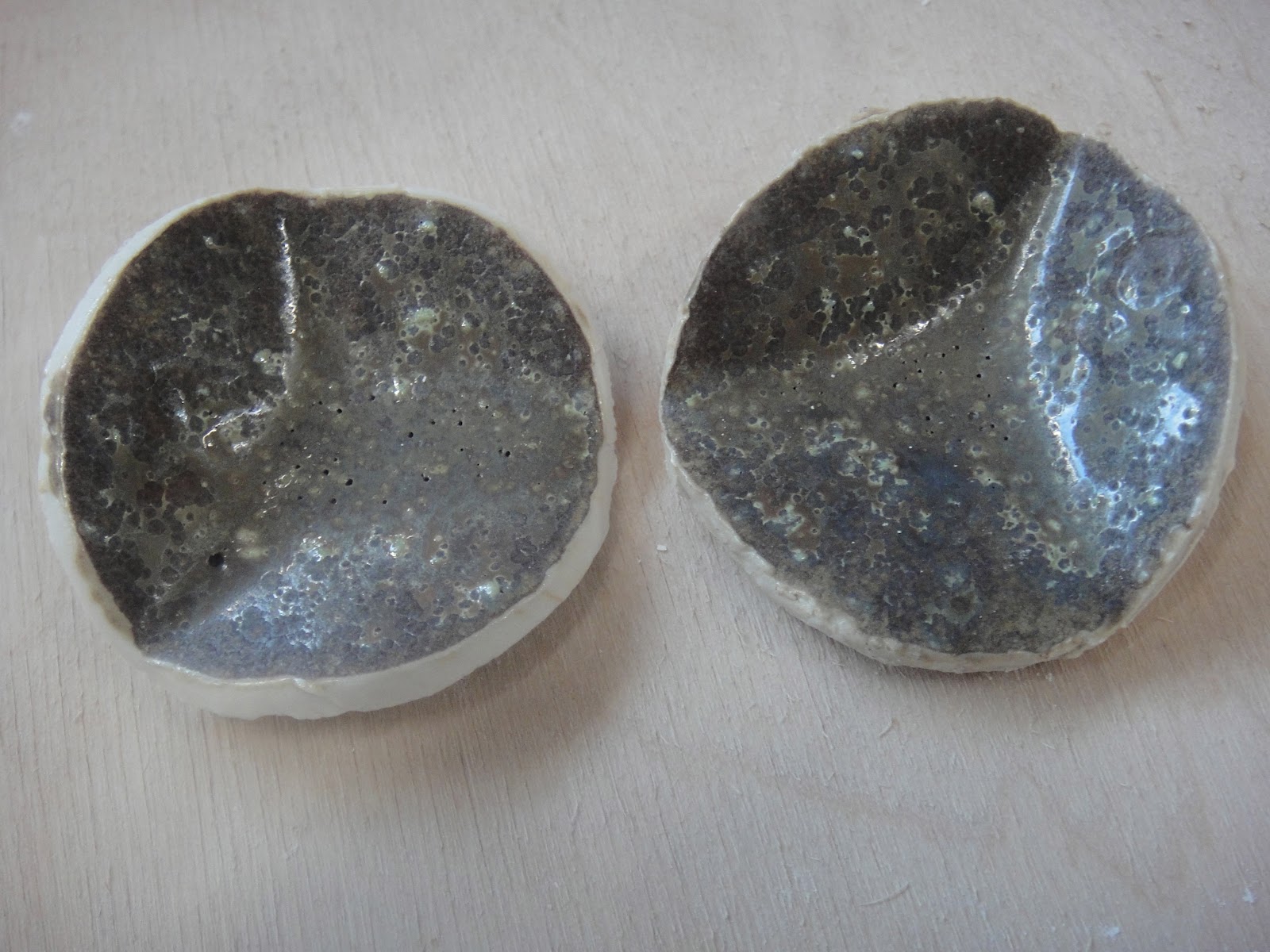
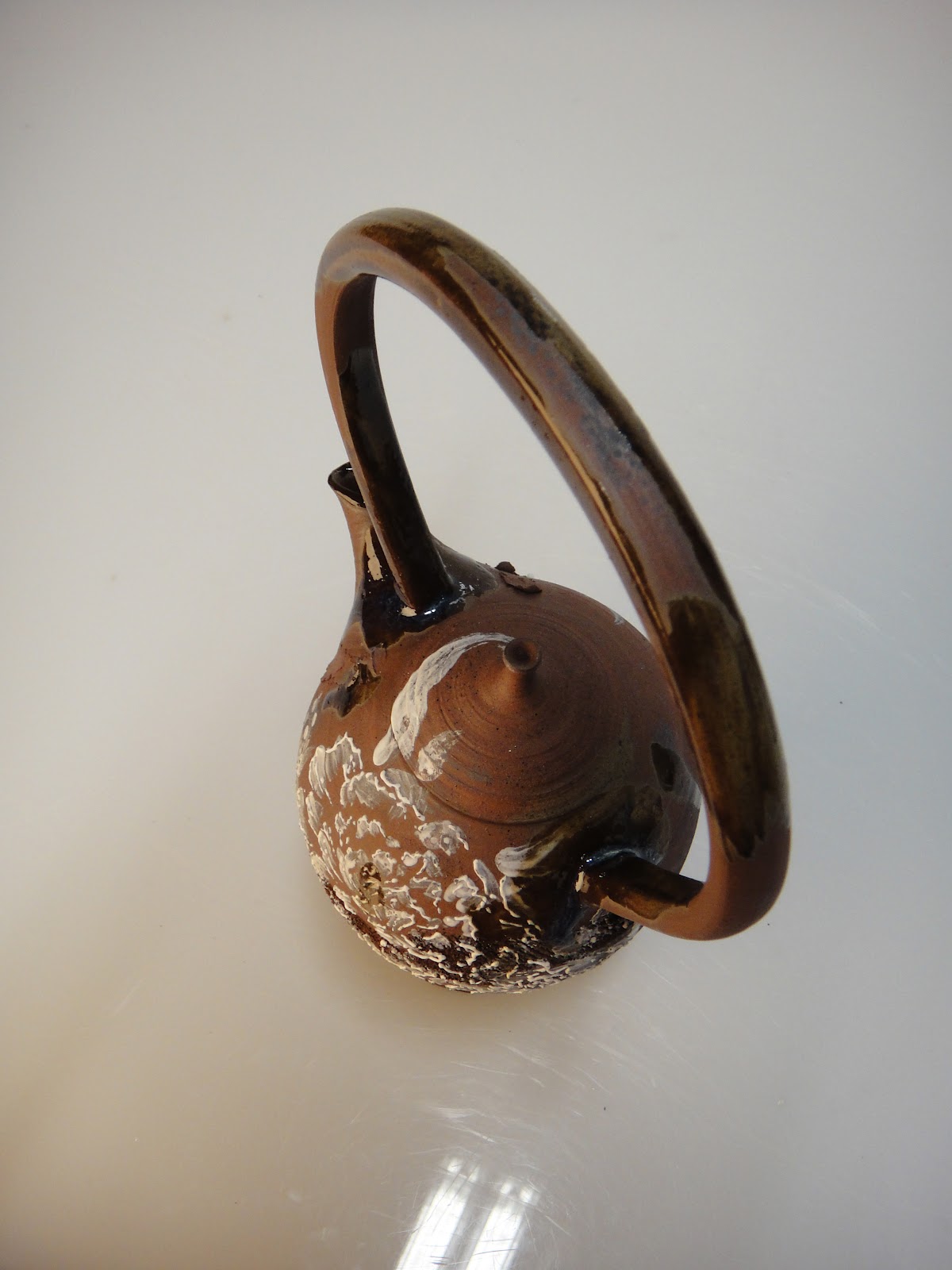
This teapot has been glazed with ocean deep again, but this time the firing did not include a cooling ramp, so the bubbles have not been allowed to escape and the surface has a foamed up texture.


The handle has warped more than I anticipated and gained almost two corners. I'm not too keen on it now, but it will probably grow on me with time as the others that have warped have. What I really can't accept is how the glaze has run over the base and obscured the cut outs and detailing there, but this would be better if the glaze had been soaked longer and not foamed. Firing it again now would just make the running worse however. This kind of base doesn't work well with my flambé glazes at any rate, but I could use a technique similar to the one above to fix this.


The group of terracotta teapots. I love grouping them together, as variety is the spice of life, and they set each other off through the slight variations in form.

Monday 26 March 2012

Finished teapots


This is the first of my new terracotta range, with cross hatched areas to create rough textured areas, brush painted chrystanthemums and screen print in oxides and underglaze turquoise with glaze splashed over the top. I'm really happy with these, as finally I have teapots that aren't always warping in the kiln! I also really love the dramatic dark colour. I had thought that maybe the porcelain would crack or flake in places due to the different shrinkage rates, creating an interesting weathered effect, but it hasn't at all. Instead it has adhered admirably to the terracotta and taken on the characteristic translucency of porcelain, giving the brush painting even more depth and a slightly ethereal almost not there appearance. So, even though it didn't do what I thought, it still gained an aged appearance like I wanted! This also opens the door to the possibility of putting other imagery underneath the slip painting for extra imagery layering. I also really love the interaction of the glaze as well, adding extra texture and a more ergonomic grip to the handle, as well as a splash of colour. I think I prefer glazing this way, I can be more creative with it and not worry about masses of molten glaze running off the pot and potentially ruining the base. As for the feet, of the two teapots I've got out of the kiln, the feet look best with one at the side, not two as the shape flows better, but also with the cut outs as this makes them look less heavy. I have been trying to give the teapots a light and "lifted" appearance (or rather I have been avoiding slouching and bad posture?) so that people will want to lift them and use them as they look like they are reaching for the air already. It just feels right somehow.


Here is the teapot for the Wedgwood Museum. The slip trailing has also managed to glue itself to the terracotta really well, and makes a lovely contrast with the opaque dark clay. The translucency really lends itself to the wings, and I love the circuit board pattern underneath. I'm trying to express the journey tea has taken from ancient China and Japan to the modern day in England, often sat in a mug in front of the computer screen. So, we have a Japanese inspired brush painting of a Japanese butterfly (kuro ageha for anyone interested) contrasted with the circuitry and modern print of today's Western world. I hope whoever buys this will treasure it.


Sunday 25 March 2012

Midnight Ocean Bowl


Japanese tea bowl that we were served green tea
in at a little Japanese restaurant. I just about
managed to tell the guy serving that Allen
really liked his collection of ceramics :)
This was really just a very nice test piece to start off with, because I wanted to see the interaction between the new Ocean Deep and dark gold semi crystalline glazes, thinking they'd look good together if they were chemically compatible, but I love the result and this bowl has been shown interest already. It has gained me another commission only hours after leaving the kiln. I'm starting to think that my work is going to be split in two, work to show off my glazes, and work to show off print and surface decoration. The idea for overlapping glazes is taken from Japanese tea ware and also various potters who exhibit at Hatfield art in clay, such as Wendy Lawrence, and the results are usually stunning due to the complex interplay of chemicals, creating unique effects and creating fantastic variations of colour, texture and pattern. The appearance is also usually more organic and natural looking, so the work gives off a very free and relaxed vibe. The only issue with this bowl is I'm utterly unconvinced about its functionality. Allen Richards (my research partner) tells me the dark gold glaze is food safe, but I'm not convinced, as it's almost in oxide overload (the finish is metallic after all, and metals can leach out into food if there isn't enough silica to pin them down), contains copper (which makes leaching even worse) and manganese (which is a bit poisonous to be honest). Allen reckons manganese is only dangerous in oxide form though (he may be right there but I'd have no idea), that the glaze won't leach as the oxides haven't completely overloaded yet, and finally, that my concerns about the fact that the surface of the glaze is easily scratched, and so is not very hard wearing and won't stand up to acid in food are unfounded. Either way, I think I won't be happy until the dark gold glaze has been acid tested for food safety.


Clay and Glaze Testing!

Finally got some new glaze tests out of the kiln the other day!!! Allen Richards has mainly been concentrating on lustre glazes, while I have been more preoccupied still with flambé, but also matt and other mottled glazes. I can't blame Allen though, to be honest, as he's finally got the technique to work, and lustres are enough to bring out the magpie in anyone!
First off are a set experimenting with the addition of cobalt carbonate in a few of my favourite glazes to see how I could get some bluer variants, as I don't have a deep blue at the moment:
Emanual Cooper's original glaze
This is one of Emanuel Cooper's glazes with added cobalt. I really didn't expect this result, as this is originally a mottled matt brown glaze and I thought I might get a blue tinge or something! Instead the glaze has become shiny, almost gold tinged where it pools, khaki green with mini crystals (magnesium in one of the ingredients has done that) and teal where thin. After this I found out that the way this glaze went matt was due to a high number of fluxes in the glaze causing it to over flux (weird how chemicals that encourage the glaze to melt in the kiln can actually mess up the way the chemicals melt and react altogether). However, adding extra flux on top of that (cobalt is pretty fluxy) really sends the glaze into overdrive and it will become very shiny. I might try reducing the copper in the next sample to reduce the green element and hopefully bring the matt surface back. Also the dolomite.

Original Aurora Borealis glaze
This glaze is Aurora Borealis with added cobalt (Aurora is one of mine and Allen's favourite flambe experiments, although it is a little difficult to control). I absolutely love this result. The original was a lime green ground with royal blue where it pooled and turquoise jun effect over the top of that. This is basically the same but much more mellow with less saturated colours, over all darker and more of the subtle iridescence. We've named this new glaze ocean deep. I can't wait to try it out on something larger than the test tile! This is now getting very close to being an oribe, a traditional green Japanese copper glaze I'm very interested in learning about, except that this glaze is blue.

 Weirdly though, it's almost like a tenmoku if you use it on terracotta! The iron in the clay body majorly interferes in the reaction of this glaze. It pretty much pulls a full on invasion really. It's amazing for bringing out the marks left from the throwing though, it's incredibly striking. This is much darker than anything I've looked at using before though. Where it pools it's pretty much black, with rust reds, oranges, yellow and even green where it's thinner.

 The original glaze for this test before the cobalt is Solar Eclipse, mostly abandoned since it was superseded by glazes with more jun effect and more colour overall (also less pinholing - our glazes like to bubble). However, it was really interesting as although the background came out mostly white, the pooled areas had a   kind of purplish navy streaking and jun effect. Our main problem with it was the lack of colour, and we soon developed a bright purple with a new base glaze and the same oxides. However, if the background could be coloured, this Solar Eclipse would take on a whole new lease of life, and cobalt, from my observations with previous experiments in these base glazes, always principally colours the background. As you can see, that is pretty much what has happened, although I had hoped there would be a greater amount of streaking and variation in hue. It has also pinholed badly. This probably still needs some work to achieve it's full potential.


 This is another test with the Emanuel Cooper glaze, but this time with iron oxide. I'm not really sure what I expected this to do! I think possibly a different shade of brown. Still, the iron has mainly over ridden the original properties of the glaze and created a surface that looks very much like rusty metal. I love the tactile quality of it, it's such a contrast from the usually glassy results, and has an authenticity due to its sympathy to the actual clay's texture. It feels so natural in the hands. I have noticed over the period of my studies that much ceramics uses very shiny glaze, and that people actually really prefer matt or rock like surfaces on their ceramics. If they want shiny, glass is much better at it. They want material that comes from the earth to look like it. Wabi strikes again! I think I might try reducing the iron a bit though to allow some of the original glaze properties to come back.

Next is my other favourite result besides Ocean Deep:


This is the Emanuel Cooper with manganese and reduced copper. From research Allen undertook I thought I might get something approaching a matt mottled gold, but I got this instead. I think it's stunning. Unfortunately the surface scratches easily, but it is silky smooth to the touch, and a very dark gold in colour. The surface is scattered with tiny gold crystals (magnesium again) and there is subtle iridescence on this glaze too. I'm not actually a fan of large expanses of bright gold, for a start, I much prefer silver, and secondly I tend to find it a bit tacky because overuse makes it look fake. It's just never been my style, although Allen works with it very well. However, this glaze is so subtle, and has so many qualities that aren't obvious from a single glance, that I find it quite alluring and interesting to look at because it can be explored. I also think it looks very natural and is a beautifully striking contrast to the other brightly coloured glazes I use.


After the success of the first one, Allen quickly mixed up a new test with more of the oxides from his original gold glaze in the hopes of developing the gold properties in this new glaze. However, all it did was turn the glaze matt, increase the crystals and reduce the iridescence. The photos won't pick it up, but there's also a hint of mauve in there as well. It's an interesting result, and more what I originally aimed for, but I prefer the first test as it has more interesting properties and a better colour.


Of all the glazes tested, this is the only one I really consider a failure. This was based on Sun Flare, a honey and lilac coloured glaze with jun effect over the lilac where it pools, and I added iron oxide in the hopes of developing the honey colour and possibly getting tenmoku effects (I have done screen print tests with the same oxide underneath Sun Flare, with spectacular results - I will post about that soon). However, I persuaded Allen to put in far too much iron against his better judgement, and the oxide has overloaded, caused bubbles and left a gunmetal finish on the bottom. This will be tested again with much less iron. Probably about half as much. 

This is a different Emanual Cooper glaze (originally a matt white with interesting variations in hue and crystalline tendencies in reduction). I'd hoped for a turquoise or green matt with the variation in hue, but again, it was matt due to over fluxing from zinc, and the addition of more fluxy oxides has turned it shiny and allowed the zinc silicate crystals to take over. A lovely result, but not what I'm looking for on my current work, and the crystals have overcrowded themselves as well. I think I'll try reducing the zinc a bit and see if that will bring back the matt surface.

There seems to be a weird gold shimmer across this part of the sample.


 Finally, we tested our Royal Purple (a bright purple glaze with jun effect) with cobalt to expand the colour possibilities, and it is now much bluer, more like the traditional indigo dye often used in Japan. Next task will be to make Royal Purple more pink so that we truly can achieve any colour of flambé. I originally started researching these glazes in an effort to reproduce the colours of modern Japanese media with a natural and traditional type of mottled glaze, and expanding the colour palette is a part of that. It's also just peaked my curiosity. Expanding the range of colours will help to widen the appeal to the general market as well, as everyone has a different colour preferences, the colours set each other off when shown together, and people also love to mix and match within a set or style.


For these tests we have developed a new test tile, which for the first time is truly both of our work. Allen had been trying to create a thick walled shallow dish with a tiny delicate foot ring, but could not get a satisfactory result from the jigger jolly for which he had made moulds. I had yet to develop a test tile that I truly liked and could make in bulk. So, I decided to throw shallow dishes for Allen and put my signature spiral in the base, and then he turned the foot ring, which is his speciality. This is much more economic for both of us, and the results are beautiful too :)

We hope to be able to market these with the glazes on in the future as snack bowls, tea bag holders, or just pretty objects in their own right. The speed we can make them at means we can batch produce them for shows, and they can form a very affordable range for people who want to buy a little something.


The last thing I did was test terracotta's ability to stand up to porcelain temperatures in the kiln - 1260 degrees C.

It stands up to it better than porcelain does in the end, although is much more prone to thermal shock in the cooling, so I must be careful not to open the kiln until it is fully cooled. The handle has not warped at all, which is a breath of fresh air after so many faults in my porcelain tea pots. It is also a really nice deep russet brown with a few iron speckles, similar to Japanese tea ware I'm inspired by. Now I'm ready for the actual teapots to fire.