I've been experimenting with slip trailing , and wanted to know what effects I could get with colour as well as white on white. I wasn't sure whether this would detract from the embossed effect and make it look tacky, so I ran some tests with various oxides mixed with the porcelain as colourants. From left to right on every tile there is one stripe of aurora borealis glaze (green and blue transparent to opaque flambe effects), one stripe of my favourite clear zinc based glaze and then the right is completely unglazed. I also want to try gold luster on the slip trailing at some point, but that will have to wait!
I've also included the coloured clay tests I did with the same oxides previously for comparison.
Here are the results:


This is one of my favourites due to the bleeding of colour. The embossing is emphasised but blends nicely into it's surroundings, although the copper overload has somewhat mucked up the aurora glaze. This is rather curious as a result, as the same batch of porcelain and copper used as coloured clay turned jet black and bubbled like mad. It's bleached out and bubbled much less here.


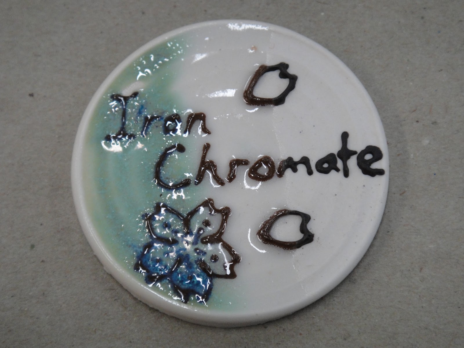
This one is quite subtle under aurora and a lovely green with no glaze, but unfortunately chrome doesn't react well with zinc. Although, I hate admitting that to my research partner. It's also a bit toxic, so unglazed can't be used anywhere it comes into contact with drink/food/lips. It should be fine under the glaze as it's locked in.


I did the chocolate clay (I know it's not an oxide, but hey, it was in the glaze room!) sample after testing red clay to see how different they would be. The answer is they are almost exactly the same mottled mushroom colour. Not very striking at all.


Cobalt comes out well, but being such a strong ingredient that's not surprising. It has a tendency to flux the clay more than the other oxides, so you get a slightly shinier finish even without glaze. It has a lovely intense colour, but you could create different shades easily by changing the amount you put in the clay. It might be fun to use this to try a kind of kitsch traditional blue and white effect that you often see in oriental ceramics. It seems to go a bit wild with aurora though so it may need to be tested further to iron out any issues there.


Mushroom grey again.


A nice dark outliner that reacts well with the glazes. It's also nice that it's a red clay compatible with porcelain for contrast, as terracotta and porcelain tend to crack away from one another.


Rutile makes for a really good yellow, especially unglazed. It also works well with the glazes, but I don't think aurora and rutile are the best colour match. It's quite beautifully subtle under the clear glaze though.

*goes to find example*

*stumbles across an example using an oriental flower*
... Now I really want to try this on a pot :S
Why didn't I look at blackwork before?
The shading on this piece is created by adding extra stitches or lines in the patterning where you want a dark patch.
No comments:
Post a Comment