 I bought a bunch of chrysanthemums, carnations and different daisies to study and draw from, and ultimately visually play with on paper :)
I decided I wanted to inject my own ideas and style into what I was looking at rather than just record what I was seeing, and these are the results so far (incredibly, the flowers haven't shown much sign of dying so far - even after a couple of weeks there are still some opening up!)
With my teapots I've been trying to layer up imagery and print on the surface, so I tried playing around and masking off the outline of a cherry blossom with masking tape. Then I used brown ink to paint the chrysanthemums, sumi-e style! The brown is a bit more subtle than using black, and tones nicely with the brown paper. Having got this far, I decided the detailed drawing on it's own wouldn't be enough to allow the sakura outline to be clear and stand out, so I roughly brushed some translucent iridescent blue white ink over the flowers, and finished by tinting the flower centres with coloured chalk dust.
Then came the tricky bit - taking the tape off again.....

I really like how the two of these images came out, but I actually really like the piece before I removed the tape. It looks like the next experiment is going to involve cutting and sticking coloured paper flower patterns to make a sketching/painting surface! I really like the way the imagery overlapped and glowed through one another. I should be able to translate this onto the teapots using coloured clay, slip trailing and screen print all layered up. I think just a small area of imagery like that (created with some nice earthy oxides or something subtle) could be really understated but really elegant too. It'd be too much if it covered the whole piece though.

Here are the rest of the pages so far.
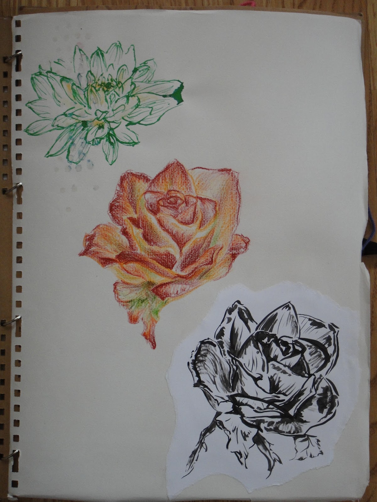
- Roughly sketched rose in dry watercolour crayon, basically a quick exploration of colour
- Sumi-e rose in black ink, exploring shape, line and shadow.
For anyone interested, the Japanese name for rose is bara. The anime Saiunkoku monogatari has a really interesting fairytale it mentioned about the "rose princess" (bara hime). I don't know if this was just made up for the plot line, but it talked about why roses had thorns. Basically, the rose princess was a bit more than mortal, and very beautiful, with the gift of being able to cure any ill. Then she fell in love with a human man, so lost her power and died, becoming a rose and growing thorns so no other man could pick her.

Brush and brown ink chrysanthemums tinted with yellow, green and white chalk dust. I was trying to understand the form and shape, how they grew, and capture the spirit of the flower.

As before with a daisy and different kind of chrysanthemum (I think). I took adding colour to the brush drawings a bit further here, using watercolour to create rough shading and tints. I also put the print next to the drawings as a contrast to the layers.

More chrysanthemums - I'll probably work more into this drawing later

The other kind of chrysanthemum, this time with black ink and coloured print. I'm not so impressed with the starkness of the black compared to the brown ink, but I like the effect where the brush was starting to go dry - this is also what wabi sabi is for the Japanese. For some reason the fading nature of the ink reserve running out gives drawings a transient feel and beauty.

Iridescent print, with watercolour crayon and clear embossing liner daisies. I was trying to get a similar effect to slip trailing here with the raised outline, and then contrast it with coloured outlines.


 |
| The Golden Tearoom, built by Toyotomi Hideyoshi |
 |
| Wooden carving of a dragon with added gold accents on the bottom of a huge paper latern |
Anyway, why chrysanthemums and daisies?
The chrysanthemum is the official national flower of Japan (cherry blossom or sakura being the incredibly popular unofficial one), and in Japanese floriography (flower language) they mean happiness and long life, and are sometimes seen as an object for meditation. The daisies and chrysanthemums are very frequently seen in Japanese imagery and patterns, including everything from kimono to mon, Japanese family crests. According to wikipedia:
" Japan
- The Chrysanthemum Throne is the name given to the position of Japanese emperor.
- Chrysanthemum crest (菊花紋章, kikukamonshō or kikkamonshō) is a general term for a mon of chrysanthemum blossom design; there are more than 150 different patterns. The Imperial Seal of Japan is a particularly notable one; it is used by members of the Japanese Imperial family. There are also a number of formerly state-endowed shrines (官国弊社, kankokuheisha) which have adopted a chrysanthemum crest, most notably Tokyo's Yasukuni Shrine.[15]
- The Supreme Order of the Chrysanthemum is a Japanese honor awarded by the emperor.
- The city of Nihonmatsu, Japan hosts the "Nihonmatsu Chrysanthemum Dolls Exhibition" every autumn in historical ruin of Nihonmatsu Castle.[16]
- In Imperial Japan, small arms were required to be stamped with the Imperial Chrysanthemum as they were considered the personal property of the Emperor.
- The Chrysanthemum is also considered to be the seasonal flower of September. "


