Monday, 30 September 2013

Tea House Complete!

Finally it is done! Here are the final photographs before assessment (after assessment it is going to the Public and the outside will be painted grey to match the other tables and plinths).

In the end, to simulate the traditional Japanese clay/plaster wall finish used on the tea house in the British museum, I ended up using textured masonry paint! Dulux colours were just too bright and colourful, and wallpaper, although it would have looked fantastic, would have been impossible to touch up if it got damaged in transit, and without knowing how good a finish I could achieve having never used it before I decided it wasn't practical. I also considered fabric stretched over the boards and painted, but the cost of the fabric on top of the paint would have been prohibitive (and I couldn't get a Dulux colour I liked as I said). Here it is waiting on the paint to dry.


So while that was drying, I glued the washi paper onto the frame that would form the "window". As it turns out, I wished later that I'd glued the paper on after gluing on the bamboo frame, because of course where the glue spreads it weakens the paper and leaves marks where it runs, but overall this operation went pretty smoothly, so this is just a note for efficiency next time! The paper was unbelievably see through, and I was glad of the accidental ridge inside the frame where the lighting had to sit, because it prevented tiny pin pricks of light being obvious through it. When I finally got the "window" up and lit up, it looked like there was this halo of light inside! So as for looking like natural daylight, that failed, especially since the cool colour of the light from the LEDs shouted against the warm lights in the installation room and didn't look like sunlight at all! Instead, it looked like this super modern contemporary light fitting, and gave this kind of edgy atmosphere that reminded me of Tokyo, the ultimate blend of history, tradition and the cutting edge, which I really liked. After all, my work is not Japanese, although it is inspired by Japanese ceramics, and it is more fitting that work that is a new interpretation should be shown in a setting which is a new interpretation as well. Unfortunately though, true to the reviews on the website I bought them from, the LED lights aren't the best at staying stuck down, and may need gluing on as well later...


The finished tea room! I didn't have time to do all of the ties down the bamboo for this shot, but you get the rough idea :)

It's come out really well so far (especially since I'm using recycled boards). It has the scent of a Japanese room unlike my last attempt in the gallery, thanks to the real tatami mats, and overall it's much more authentic this time! Although it all still feels very clean and new compared to traditional Japan; there's no patina yet. 


It has a great cosy feel to it, my main downside is that for it to look good, I can't display as much inside as I did with the last exhibition. To look Zen, the shelving display needs to have only a few pieces on it so they can really stand out as individuals, and to give the wabi sabi lonely feel. I think in the shot below, I had too much on there. Maybe on the bottom shelf I just want one Naruto bowl, and one on the top shelf, and then a teapot and tea caddy or something on the middle shelf. Strangely, before the bamboo went up, I discovered (to my horror!) that the yellow hue of the paint brought out a yellowy hue in the green glaze of the pieces on the shelf, washed them out and made them look a bit vomited on. Magically, the minute the bamboo was up it looked normal again (the effects colours have on one another are amazing, the reddish hues must have balanced everything out) but next time I will definitely have to be more careful when selecting wall colours!


Now the display is all packed up and waiting to travel to be set up at the MA show! Since I can't be there to set it up (I'll be in Turkey for a symposium) I'm having slight kittens about whether it will be ok..... fingers crossed my instructions are legible!

Wednesday, 25 September 2013

Tea house - so far!

It's been a while since I last posted, so I have a lot of updates to add!

First off, there was a trip to the Public in West Bromwich to look at the exhibition space we will have. For some years the MA show has always been held here, but Tracey Emin has exhibited here too recently, so the lecturers are abuzz with the extra crowds that will potentially pull into the building while our show is on. However, this is not your traditional art gallery. The Public is really a huge modern multi purpose community building with extensive gallery spaces and interactive exhibits, that specialises in visual media display with loads of flashing lights and projectors and hosts the odd belly dancing class. The architecture is very modern and somewhat whimsical, with a spiralling structure/layout inside, and many of the visitors I have seen have been young families enjoying playing with various cameras and press the button displays. Very clearly this is a place not just for viewing, but joining in, so making my display interactive (through tea drinking) will hopefully appeal to the audience here! 

We had a good look around to try and find spaces within the building that might suit our work, and to start to work out the practicalities of our display to fit this - or at least, that was the theory! In essence, I had already planned to transplant my own custom made space into the existing space, so all it needed was enough floor and height clearance with a convenient nearby plug socket and good lighting from above. Although in my case, a convenient sink and kitchen area would be preferable!


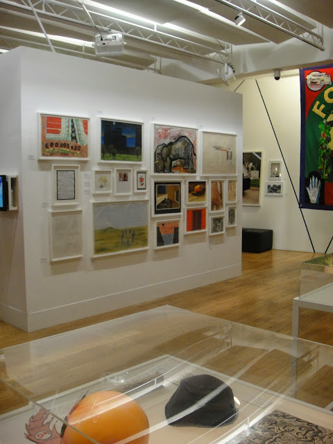
These are some shots of the gallery space often occupied by fine art students. The spaces had good lighting, alcoves, and were very airy with plenty of open spaces, so they had the potential for neatly fitting my installation in, and the contrast between the stark, airy open spaces and my cosy, rustic tea house would have been really interesting and striking to visitors.


This spot would have been brilliant, right in the entrance to the upstairs gallery, if it wouldn't have contravened fire exit rules............


This is another interesting space just to the side of the entrance which had a lot of nice natural wood around which would have complimented my theme, but it wasn't very convenient; you can see it lacks plug sockets and is off to the side of where people would normally walk.


There was also a similar space on the opposite side of the entrance.


In the end it was decided the ceramics students would all go in the black room halfway up the spiral, as it has suited previous MA ceramic exhibitions, and we could have a cohesive display in our own space. It turned out that not only I had decided on an installation style display, but at least three other students also wanted to set up installations, and there were others who wanted to use specific displays to help convey the ideas behind their work, so we could all be curated into a kind of tour through different zones and a mini exhibition within an exhibition. It would also mean good plug socket access for me, and access to a kitchen area where I could fill a kettle and boil water. The area also had a dedicated lighting track overhead.


It was also the space Tracey Emin was in!

As for the tea house, here you can see my scale model before I added the shelves and bamboo beams. This was used to help explain what I wanted to the woodwork technicians who helped me build the full scale version!


The design is quite simple, the tea room has a display alcove and a window/ light fitting to help give some atmosphere, and it will allow me to display one set of work in the alcove for viewing while another is out on a tray/low table in the centre being used to serve tea. Luckily, the boards I need to construct the walls were kindly donated/rescued from a trip to the skip, as the university were throwing some out, saving me a cost of £100 for new ones, although they were a bit on the battered side. The bamboo and lighting had also turned up, as well as the washi paper for the window, so I had almost everything I needed. The bamboo looked great, but I had fun fitting it as not a single length was straight! 


I also seemed to have made a miscalculation with the window, as the inner ring did not match up with the outer ones forming a recess where the light would go, but since it fitted the hole made for it, this was not so important. The lighting could be raised up on padding, since the LEDs generate very little heat.


Stage one: Corner wall pieces screwed together 


The tea house finally under construction in the wood workshop next to the finished scale model.


After all the boards are joined together (the flat sides with butted edges were done last with metal plates and screws) Bryn cut the hole for the window.


 After that, it was time to make and fit the distinctive Japanese zig zag shelf.


And then on to drilling the holes for the ties to go through for binding the bamboo beams over the joints they are supposed to conceal. I purchased black linen thread for the purpose for a couple of quid, and it did an admirable job of being both strong enough and vaguely authentic looking. Each tie criss crossed over a joint in the beam to try and imitate Japanese construction techniques. It also helped stop the bamboo moving around, as these are also the fattest parts of the beams. 


At the end of the day I just piled everything into the tea house for storage ready to finish construction and proceed with painting. As soon as the walls were up the space took on a very den like feel, and it was fun to turn it into a base camp while I was working! Already it felt cosy and intimate, and strangely, personal as well.


 After this, the window needed to be painted then glued together, and the wall covering decided on, purchased and applied, which is currently in progress. More about that tomorrow! Night night